Perhaps one of the most important aspects of any type of ad is that the brand it is associated with be recognizable. This is especially true for ads that are seen for mere seconds. Recognition can be accomplished by consistently using certain fonts, colors, and even templates associated with a brand.
In addition, ads can be designed only with the goal of brand recognition. These types of ads do not have a call to action and consist of only a logo or a logo and a common brand message. Think of the neon signs in bars or the ads in Times Square for Pepsi or Coca Cola.
However, small businesses do not have the brand recognition like these big names do. That does not have to be a point of discouragement. Instead, it can be seen as an opportunity. Whatever type of ad you are creating, or whatever medium you are working in, your logo can either make it great or detract from the overall message.
How do you best use your logo to brand your ads? Here are some tips for you.
Basics of Logo Design
Logo design is not just about putting some text in a clever font or choosing a clever symbol and leaving it at that. Good logo design is a process, and one that needs to be approached with care. There are some key factors to consider.
First, your logo must be unique and clever. One of the toughest things to do is to look at your competitor’s logos, find one you like, and use it as inspiration without copying it. If your logo is not unique, you may even face copyright infringement if your brand gets big enough to be noticed.
To avoid this, you can check for plagiarism at sites like Logo Thief. It is better that you check this beforehand rather than getting in trouble later and having to reset your branding entirely.
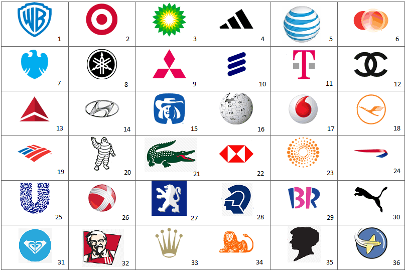
Second, your logo needs to speak to your branding. Whether you are a restaurant, a store, or a branded product, you have an image, and your logo needs to reflect that image. A logo also does not have to include text. It could be a unique combination of items from your industry. It could even be something as abstract and simple as an apple with a bite out of it. Another example is the Wikipedia logo of a globe covered in language symbols, which communicates a lot about the brand and its messaging.
A text logo could also be very effective. Think of the Nike symbol compared to Adidas. The Adidas logo comes in several forms depending on where you see it, but it has three vertical lines and the word Adidas in every iteration. Coca Cola has a simple text logo, but it uses a unique by the font, one that now people attempt to imitate.
If you are going to design your own logo, be sure to get the opinion of a lot of people before going forward with a full launch. Be sure these are professionals who feel free to speak freely about your design and to tell you what they really think of it. You can even create polls and get feedback online from places like 99designs and get help with logo creation at sites like LogoYes.
Size
Now that you have a well-designed logo, it’s time to use it in your marketing. The question is what size do you make it? The answer is quite simply that it depends.
Your logo can be used in a number of places: apparel, invoices, printed materials, digital signage, posters, physical ads, your website, digital ads, and in PPC campaigns. In short, it can be used anywhere your brand is and anywhere you want it to be recognized.
The size of your logo will depend on where it is being used. There are some simple guidelines, depending on the type of ad you’re creating.
- Brand Recognition Ads: In this case the logo should be the largest part of the ad. You are not adding a lot of text or a call to action, so your logo is the ad.
- Ads with a Call to Action: In this case the logo should not dominate or detract from the message of the ad, but it should be present and readable or easily recognizable. This usually means a small to medium logo. It is enough that it is just there.
- Ads with Photos: Often what gets an ad noticed is a photo or video, often known as a hero image. In that case, your logo is secondary. You can use it in a corner of the image or video simply for brand consistency. The logo should not dominate, as it is intended to be noticed in passing.
These size tips may seem simplistic, but asking yourself what the focus of your ad is will determine how large or small a role your logo should play in it. If you have a graphic design team or hire one to create marketing materials for you, they will have the best advice depending on each specific campaign.
Color
The color of your logo can be changed depending on the background, and it helps the logo stand out in the ad. However, be careful. Colors have a psychological association, and you don’t want the color of your logo to contradict with the message of your ad.
- Red: energetic, sexy, bold
- Orange: creative, friendly, youthful
- Yellow: sunny, inventive, optimism
- Green: growth, organic, instructional
- Blue: professional, medical, tranquil, trustworthy
- Purple: spiritual, wise, evocative
- Black: credible and powerful
- White: simple, clean, pure
- Pink: fun and flirty
- Brown: rural, historical, steady
Evaluate what you are really trying to say with your ad along with how the logo will contrast. Then choose a color that matches both efforts.
Placement
This may seem like a no-brainer, but the placement of your logo matters a lot. There have been scientific studies that show why one placement over another makes a difference. Like size and color, some of this will depend on the ad you are creating, the message you are trying to get across, and the role your logo plays in that.
Here’s the deal though: which side you choose does matter. Here are some tips:
Left vs. Right: A/B testing shows that logos on the left lead to more brand recognition (39% vs, 21% for the one on the right) and are more likely to be labeled unique or stylish than ones on the right. There is a reason left placement is more traditional, and it has everything to do with science.
Left vs. Center: In another study entirely, the placement of a logo either on the left or in the center of a website were tested. The left logo was better for web navigation, but there was no difference in brand recognition from left to center.
What does this mean to you when it comes to logo placement in your ads? In most cases, placing your logo on the left will be best, but placement in the center also works well. Where the logo goes will depend largely on ad design, but a logo on the right will be less likely to be noticed and remembered.
Time Visible
A simple thing to keep in mind is how long the logo will be visible to the viewer of your ad. In a print or static ad, that may be a long time. However, in the case of digital signage, the customer may have only a matter of around 20 seconds to view your ad. The attention span of many users is even less on a webpage where is could be as little as six seconds.
This means that the clarity, size, color, and placement of your logo are all key elements to it being a successful and profitable part of your marketing. Remember, your logo is not your brand, but simply a part of your branding. Don’t overemphasize it over your messaging.
The proper use of your logo in branding ads is a vital part of your overall branding and marketing strategy. Its use will depend on a number of factors about where it appears, but following these simple guidelines can make sure you get the most out of using your logo. Your logo can add to your advertising success rather than taking away from it.
Questions about how to design and use logos? Contact us at [email protected].


