The ad you developed for digital signage is out there and generating interest. Users are taking heart to your call to action. They are texting a word or phrase to your unique SMS Short Code or visiting your website to redeem the coupon code you provided.
You’ve seen a spike in traffic. You know the ad is working and reaching your audience. However, when tracking your marketing ROI, that traffic does not seem to be generating conversions. What’s wrong?
The answer might be your landing page and the specific call to action (CTA) you have created there. To get someone responding to your ad from curious to convert, it takes a killer landing page.
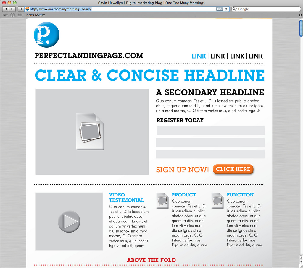
Let’s examine the scenario: your customer sees your digital ad, which says “Get a 10% off coupon when you text NOVEMBER to 686789.” The customer does, and your response SMS sends them a link like this: mypage.com/offer. Where does that link lead? Here are some crucial elements of a landing page with a specific call to action.
Your Unique Selling Proposition (USP)
First, you need to have a unique sales pitch. This does not have to be for the user to purchase a product. It can be for them to download a free eBook, to subscribe to your newsletter, or to even get a coupon emailed to them for use at a physical location.
Your USP consists of a few key elements. They don’t have to appear on the page in this order. In fact, they probably should not. They just need to be present.
- Main Headline: First, you need a catchy main headline. This text should match what the user clicked.
- Supporting Headline: This text expands on and supports the main headline, enticing the reader to continue forward in answering your call to action.
- Reinforcing Statement: This is a statement that appears on the page and reinforces the headline to maintain interest.
- A Closing Argument: This is the final reinforcing hook that gets your visitor to finish filling out the form.
A well-crafted USP not only sets clear expectations for your customers, but it also lets them know why they should care.
The Hero Shot
The hero shot is simply a photo or video showing your product in context. For a restaurant, this can be the photo of a menu item on a table or being enjoyed by a patron. Think of Pepsi, Coke, or even McDonald’s. Their landing page would include a photo of the product being enjoyed.
Video is another great tool for landing pages. Think of Red Bull campaigns where people drinking the energy drink are seen doing incredible things that all take a lot of energy.
This is your opportunity to show off your creativity and your product at the same time. The same old thing, a poor-quality picture, or a video that just misses the mark may turn your customers away instead of making converts out of them.
Benefits
This section should be self-explanatory, but it can actually be a bit confusing for brands. Each benefit listed should have a main headline followed by a brief description.
For example, a benefit of a long-lasting battery could be put this way: “Our batteries last twice as long as the competition.” In this case, you are using a bad example to illustrate how good your product is. On the other hand, you could say “Our batteries mean you can keep playing all night long.” This is using a positive or good example to illustrate a benefit.
Talk benefits first. In your detailed description of them include features for those who need more detail. Using the battery example, you could add as a supporting statement: “Our unique lithium-ion design will hold a charge longer and won’t wear out over the life of the device.”
If the conversion is a newsletter or a free eBook, describe the benefits of your list: “No SPAM, ever!” or “News You Can Use, Once a Week!” Provide a little more detail of what your newsletter usually contains in the details section.
Keep this brief. You are simply trying to get the user to fill out the form or submit an email address. You can give them more in-depth stuff later on.
Social Proof
We all want to be part of something. A big part of conversion is to offer social proof: the number of downloads so far, subscriber or customer numbers, and even customer testimonials. These all work to reassure the customer that they are not the first one to try your product, but instead are part of a trend, a social group that is strong and gets results.
Forms of social proof can include, but are not limited to:
- Customer Testimonials
- Social Signals (How many shares or retweets you have)
- Customer Count
- Trust Seals
- Awards
- Customer Reviews (Remember to be brief. Use short quotes only)
These items can be very powerful when used correctly. You don’t have to offer all of your social proof on a single page. In fact, knowing your audience for this campaign may mean one will work better than the others.
Conversion Goal
How will you know if your landing pages are working? The conversion goal is something for you keep in mind when designing the page and measuring success. Is the goal eBook downloads? Is it newsletter subscribers? What do you want the customer to do as a result of your campaign?
This can be as simple as getting a coupon or even just clicking on another link. The key is that you need to have this goal set before you begin to design the page and write the language around it.
Landing pages with a specific call to action can be extremely powerful if you keep these elements in mind. The hard work that you put in to creating and maintaining ad campaigns can be entirely wasted if you don’t couple them with landing pages that result in conversions.
Questions about making your killer landing page? Contact us at info@signspan.com. We’re here to help your campaign be successful and profitable.


